Data Visualization: User-Centered Design
How U/X and user-centered design methods can better communicate visual stories in a way that advances the mission of your organization.

How to use data visualizations
Data visualizations are very useful for displaying data in a summarized and understandable way. When designed correctly, they can be aesthetically pleasing and helpful for explaining what is going on. When creating a visualization, what is the most important thing to keep in mind? The user. You are creating these visualizations for your audience so it is essential that their needs and requirements are met.

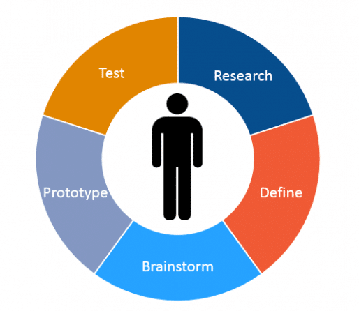
- Gathering user requirements is extremely important. You need to conduct some research. Find out what the user wants so you can create a design that they would make for themselves. Discuss why the user needs this visualization and how they plan to use it.
- The next step is to define the point of view based on your user’s needs. Who is the audience? Staff, board members, donors, creditors? The user’s point of view will drive the visualization in terms of the amount of information that should be provided.
- At this point, you will have a pretty good idea of what your design should portray and its capabilities. Here you will brainstorm the design and the steps to get there. Decide what types of graphs will be most beneficial for your visualization.
- Your idea will come to life when you create a prototype. It does not have to be perfect but it should be a rough representation of the final product. This can be done quickly in Excel or even sketched on paper. The prototype will give you an idea of how the final product may look.
- The last step is making sure your design is user-friendly. Test your design on someone who has not been involved in the project. Let them evaluate it for simplicity and design. From their feedback you will see what needs work and refine your design from there. You may have to go back to the brainstorm step to rethink the design and then continue on to prototype and test.
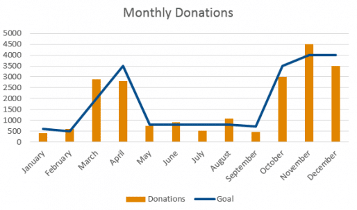
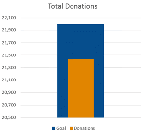
You may have a situation where you are creating a visualization for a staff member but a board member may want similar information. Below are two examples of graphs that can be used for these kinds of situations. The first chart shows the amount of donations per month with the goal line for each month. This has detail that a staff member could find very useful. The second chart shows an overview of the donations for the year showing the goal and the total amount. This graph depicts an easy to interpret summary in a simple and clear way to a board member.


Remember to have the user in mind at each step so that the design is centered on the person or people you are creating it for and not yourself. Following these key principles will help you create a visually pleasing and successful design that your audience will appreciate.
You might also like:
- Creating A Board That Works
- I Wanted to Be the Cool Boss — and Almost Destroyed My Organization
- How to Stop Managing Your Nonprofit and Start Leading
- When the Board Becomes the Problem: Reclaiming Power in Nonprofit Leadership
- Why Human-Centered AI Adoption Matters for Nonprofits
You made it to the end! Please share this article!
Let’s help other nonprofit leaders succeed! Consider sharing this article with your friends and colleagues via email or social media.
About the Author
Articles on Blue Avocado do not provide legal representation or legal advice and should not be used as a substitute for advice or legal counsel. Blue Avocado provides space for the nonprofit sector to express new ideas. The opinions and views expressed in this article are solely those of the authors. They do not purport to reflect or imply the opinions or views of Blue Avocado, its publisher, or affiliated organizations. Blue Avocado, its publisher, and affiliated organizations are not liable for website visitors’ use of the content on Blue Avocado nor for visitors’ decisions about using the Blue Avocado website.


